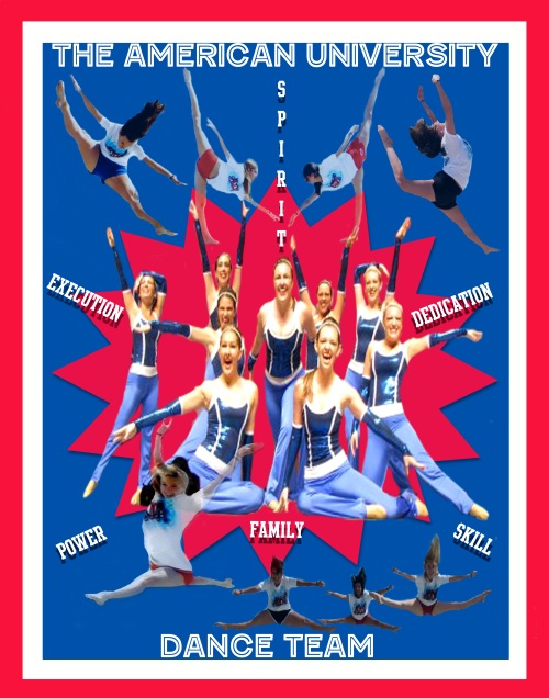
Below is my final project poster:
SuperStar
Originally, my plan was to create a poster with cheerleaders because I thought it would be easier for me to get pictures of them at our National Competition in Daytona. But then, when Dance Team was on the beach and we were taking action shots, I knew that I could create a poster that had my team jumping off the page. While in Daytona, the cheerleaders’ stances looked like they turn out flat in a picture. The only stance of the AU cheerleaders that would have dimension was the pyramids the created. I needed more than that, and so my subject became the AU Dance Team.
I’ve been influenced by my team all year and was glad to make them the focus of my project. All of the athletic sports at AU, except for dance and cheer, have calendars and team photographs in the gym and around campus. On the other hand, we are not recognized or well supported. I wanted to make a poster as an opportunity to express how talented and powerful we actually are because people do not realize our talent. For example, we had a small show in Bender and an email was sent out to all people in sports asking them to support us before we went to Nationals. Maybe five sports athletes out of all the teams came. It’s hard to support your school, when you get no support back. The genre I would call this would be Girl Power. This poster is a tribute to the AU Dance Team to support their grace, beauty, dedication, skill and power!
To make my subjects shine, I took really good photograph action shots of almost each person on the team. The girls did the dance moves that they were best at and on the count of three I would take the photo. I was really pleased that the photographs turned out well. When I wrote my blog “Dance Like you Mean It,” I had hoped to have photos like these but didn’t, so I’m glad I took the opportunity for this final project. I honestly thought there would be difficulties in catching the girls once they had completely hit their position in the air, but I was really on my game that day. I thought the sun might get in the way of the picture due to the fact it was the middle of the day, but it didn’t at all. I was able to get them right where I wanted them. What really helped me catch their movement was the timing of me with the camera and the height that they were able to maintain on their jumps. I was probably out on the beach shooting for about thirty minutes. Kelsey would jump, Hannah would run in and do another jump then there would be a group jump. Everything just kept flowing so everyone had a turn. This made it so much easier for me because I just stood in one place while every one went in front of me and did their best move. My coach took the central picture used on my poster because I was on stage performing with the team. She actually ended up taking one other picture that I used as well because I wanted one more action shot that I did not have. Luckily I don’t have to buy rights to use the photographs. The camera I used to capture the shots for my project was my Nikon CoolPix S52. To lighten and create the poster I went to the Mac lab in the Anderson Computing Complex and used the Photoshop CS4 program.
At first I wanted to have the order in which the team gets ready for nationals and have the scene circle counter clockwise. Then, after my one-on-one meeting, I realized that the best part of the poster were the action shots. The action shots are what gave the energy feeling I had wanted since the beginning. The first draft took me two and a half hours. After the meeting, I went to start a completely different layout. I added words that described the team, then added one central picture, and put all action shots around the central object. I also made sure that the border was red and not pink due to opacity. This took about three hours for me to do. The action shots took me a while to place because I kept moving them around the layout, trying to find what would work best. Also, I needed to get more action shots and crop the dancers out of the background. Finally after completing what I thought looked a thousand times better, I sent it to Professor Williams for advice. She told me to change the large amount of red in the center, to make the words pop more, to switch two of the action shots, to stick to AU colors, and to make the circle in the center not perfectly smooth. I really liked all of these comments because they were things I never would have noticed. I am really thankful for drop shadows because they made my poster look a lot more dynamic! The corrections just took another two and a half hours.
The majority of my problems arose while I was editing because at first I had set the Photoshop canvas to 11X17. Then when I realized CVS only printed 11X14 posters, I had to completely change the size of everything and make it work. CVS told me it would take a week to print the poster so I ended up getting it printed at the FedEx Office store in Friendship Heights.
I ended up solving my problem by making my poster look less crowded. I took the girls doing C jumps out because they were being overlapped by the main action shots that I wanted to highlight. I also stuck to a more simplistic font than I had before. I wanted my poster to look more professional so sticking to a sporty font instead of the patriotic font made the poster look more collegiate. I have learned that it takes many edits to make a great poster. This has taken countless hours. What disappoints me is that I did a lot more than I should have. I cropped out other pictures that I didn’t need to use.
My biggest success however was creating that “pow” factor. I think using the university colors add pride in what my team represents. I was definitely able to convey what I wanted too and I was surprised with how much the bursting star helped to create that effect. I also think the girls jumping in different corners add power at every angle. The only part that still bothers me is the speaker that I could not crop out of the picture. Behind the girl in the left corner’s head is a black object. I tried as best as I could to cover it because it was so annoying and would completely cut off my main picture if I had taken in out.
When I thought of the dance team poster, I just knew that I wanted to show the teams personality and talent. I did want to show the transition of getting ready up to the point where we compete on the nationals stage. However, I realized that people would not appreciate that as much as seeing jumps that they would never be able to do. To improve my work further I would probably find a way to maybe take one more single action shot and put it in the bottom right hand corner. The trio would be placed to the center to correspond to the people who split SPIRIT up top. I was really impressed with the steps I took to improve the project after each edit process. There are definitely significant changes in the steps I took along the way to reach the final product. I’m really happy with it and would do this again. Next year I want to film different segments of cheer and dance, compose a video of all the work we do that goes unnoticed and send it to athletics. I’m determined to give them a piece of my mind by the time I graduate.
Posted in Uncategorized | Leave a Comment »
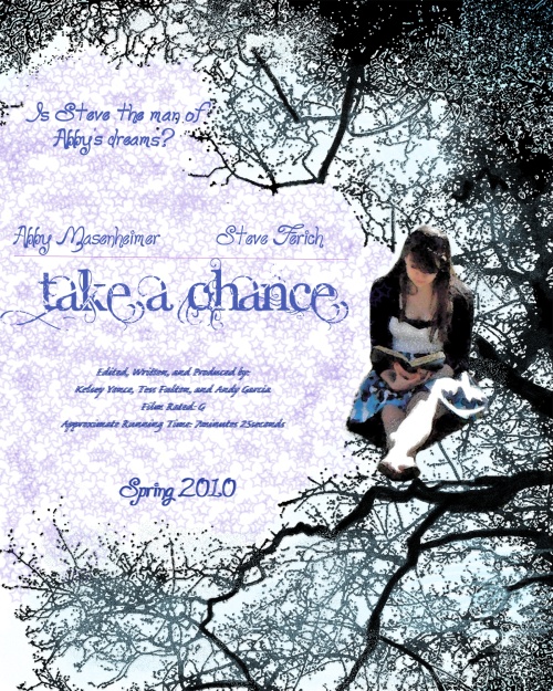
This film was created by: Kelsey Yonce, Tess Fulton & Andy Garcia.
Posted in Uncategorized | Leave a Comment »
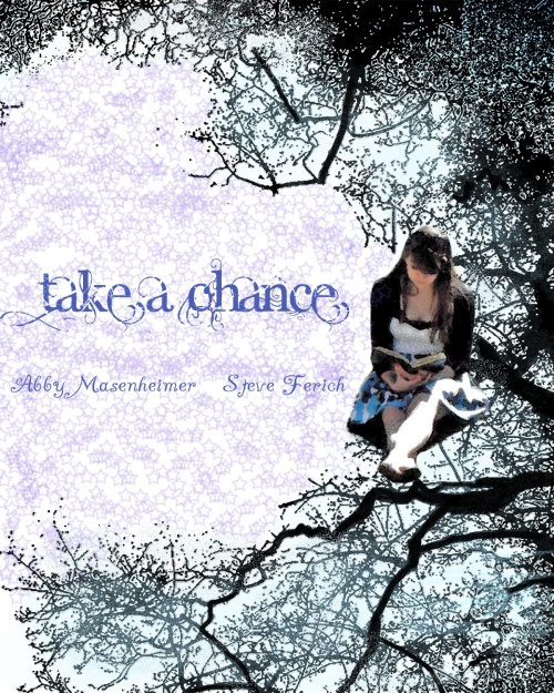
This is my final poster for my movie. It was created to symbolize the fantasy that the movie brought. I wanted to use the purple because I think it went well with the colors in her dress and it brought more of a fantasy/elegant look.
Posted in Uncategorized | Leave a Comment »
Posted in Uncategorized | Leave a Comment »
FANTASY:
The main concept of a fantasy film is to create an imaginary world that brings magic to world and allows the audience to enter an unrealistic, yet believable world filled with events that cannot happen in real life. Mise-en-scene is so critical to fantasy films because it is the composition of the film that helps the viewer to believe what he or she is seeing and have a connection to what they are watching.
This clip from Wizard of Oz represents fantasy because Dorothy is placed in another world where lions, tigers and bears can talk and become friends with her. The ugly witch is able to use her magic to transport from place to place and make the field of poppies magically effect Dorothy and her friends. Mise-en-scene is seen in the decor of the fairy tale world of Oz. Also, deep space shows how far the journey is to Emerald City. Customs are necessary to portray a real-life looking scarecrow, tine man and lion. High-key lighting fills the set with bright lighting, making the viewer feel happy in this land.
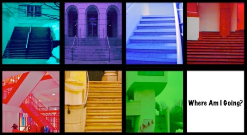
Harry Potter and the Sorcerers Stone is a modern fantasy film consisting of wizardry and magic. Like Dorothy, Harry Potter goes into a different world full of magic, wizards, moving pictures and staircases etc. This 2001 film, is able to capture the audience with the suspense and intensity of the music, lighting, and plot. Mise-en-scene is depicted through low-key lighting which helps to contribute to the intense danger of the chess game. Low camera angles are used to show the over-sized chess pieces. Decor embellishes the look of the intricate designs of the fires, doors, carved walls, and secret passage ways.
Posted in Uncategorized | Leave a Comment »
Informal Critique
Realism in Film: Kracauer believes the Lumiere films to be staged films while the purpose of film at the time was to record the natural and real world. This article also refers to how Tabu used non-professional actors to create a real effect. This also happened in the recent movie Slumdog Millionaire. The majority of the cast were not professionals and lived in India. In the 1930s it would come to be that poetic realist films would become important to directors like Jean Vigo who wanted to throw out Hollywood romance and focus on reality. With this in mind I feel like realism should be shown in theatres more. So many times we witness the love or happiness or life that someone has on the screen and want it for ourselves, when in reality we can’t. It’s so disappointing but these movies bring us into a world where anything can be possible and for those two hours we are able to be swept away from reality.
Introduction to the Problematics of “Realism” in Film, Video, and Moving-Image Culture: “The problem with “realistic,” therefore, as an evaluative criterion for judging how “good” or “bad” a film is results from the fact that all films provide a representation of reality.” If I was to go to a movie theatre and see a Star Trek movie and the technology features and special effects were so horrible that I found it too hard to believe and it didn’t look like it could resemble reality, it would be an awful movie. Unfortunately, you can have great actors and actresses but if a movie doesn’t resemble something real, there is no purpose.
It’s unreal: how phony realism in film and literature is corrupting and confusing the American mind: Author Gregg Easterbrook says, “Because we undeniably live in a world where violence is excessive, killings have become a token of Hollywood and pop-novel “realism.” However, Hollywood is always known to stretch the truth, even with movies like The Blindside, a true story that was Hollywood glamorized.
It is ok to get out of a realist realm sometimes because movies take you away from reality. When you have had a stressed day and put a movie in. it’s a way to get out of your own world. So, I don’t think movies that do not represent realism are bad. It just bothers me when movies are different from books or real life stories.
Posted in Uncategorized | Leave a Comment »


